Friday, November 29, 2013

65

Also, wouldn't want to forget about Karai!  Definitely had fun with this design too!  So here she is with some issue 10 layouts!


Thursday, November 28, 2013

64

Designing Shredder was super intimidating.  We all wanted something at least a little different for this incarnation.  So my first thought was to make him like a tank.  Just big and bulky and tough.  it was so wrong and I knew it right away.  But I'm glad I still submitted it because I got some great notes from Bobby Curnow (the best editor ever!) So I slimed down and simplified the design,  and came up with something much better, it feels like it's own thing while paying proper respect to the original.  At least I thought so hahah


Wednesday, November 27, 2013

63

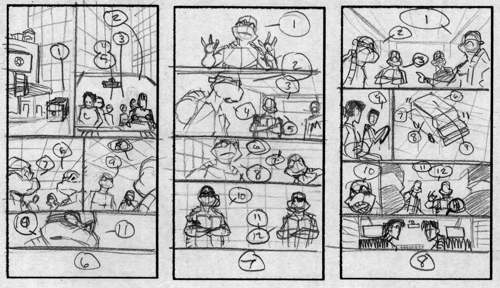
you know, really beat myself up for not being able to stay on track with the blog at certain times.  But, every now and then mistakes can work out in your favor.  For instance we are now on issue 10!  This one was definitely one of my favorite covers because it had the Shredder!!!

And today is the day that the micro series issue I did hits the stands.  And that issue is all about...  The Shredder!  Go check it out!

But for now here are some versions of the issue 10 cover.  you may notice that this color version is different from what was published.  This is my version, word from up top didn't want the creepy flashlight eyes and the scarf was a bit much.  So Ronda did an excellent fix for me.  and I know I'm being partial, but this version will always be my favorite.


Tuesday, November 26, 2013

62

This was the issue that had the first appearance of the Giant Mouser!  So awesome to take that concept and jack it up on steroids!

Monday, November 25, 2013

61

here are some of the layouts, and at the end is a scribble for an alternate version of the cover, I didn't even know I had this!  It's a treat for both of us haha

OH!  and the yellow on that layout for page 5 is a post it.  I noticed a lot of board guys and designers using them to make adjustments to their drawings rather than erasing and re-drawing something.  it never occurred to me until I saw it done.  But now it seems so obvious!  You can put a post it down, try something a little different, and if you hate it, just remove the post it!  No harm no foul.  definitely an incredible new tool that was added to the arsenal.


Friday, November 22, 2013

60

issue 9!!!!!  What's happening to splinter?!?


In addition I'll be at the Long Beach Comic Con tomorrow (Saturday) wandering, and at 4 pm I'll be signing at the IDW booth with Tom Waltz!

Thursday, November 21, 2013

59

And one of my favorite sequences of the issue!


Wednesday, November 20, 2013

58

And here is the issue in the absolute roughest way possible!


Tuesday, November 19, 2013

57

unfortunately the sketches sent for approval were lost for the issue 8 cover but I still have the inks and this was a concept that didn't change much.  It was Mouser madness and I think we all agreed this worked!

Monday, November 18, 2013

56

and to finish off issue 7, here are some character sketches for a story arc I didn't get to work on.  and some revised layouts.  Just some behind the scenes scribbles


Friday, November 15, 2013

55

and a couple of those pages cleaned up and inked!


Thursday, November 14, 2013

54

this is also the first issue where I started doing teeny tiny layouts.  I like doing layouts super rough way better than going clean right away.  It keeps me from treating them too preciously.  So if there are editorial notes it's no big deal, but more importantly I can look at them as a rough draft.  So if I have an idea on how to improve a page I don't feel locked in.


Wednesday, November 13, 2013

53

Ok!  I got to take my break for way to long but now I get to jump back in with Issue 7!
So here are some versions for the cover.  layouts to colors!


Tuesday, November 12, 2013

52

and since I spent all last week showing things that may have been already seen somewhere else.  here is one more!  hahaha


Monday, November 11, 2013

51

and the most recent one was for The Departed.  I'm still a little disappointed that I couldn't do a good Jack Nicholson, but there are things I still like about it.  And the scene itself is incredible


Friday, November 8, 2013

50

then True Romance


Thursday, November 7, 2013

49

Then it was Empire Strikes Back


Wednesday, November 6, 2013

48

after that was one for an awesome little TV show called LOST


Tuesday, November 5, 2013

47

next there was The Mechanic


Monday, November 4, 2013

46

on the off chance that I have free time I like to grab some photo ref and do studies.  Drawing from life is always important and photo reference is a close second.  Also, Massimo Carnevale has a great blog where he is doing illustrations for movies sketchesnatched and it's crazy inspiring!

So I kind of combined both things started doing studies of stills from movies.  And even though they're up on the deviantart I thought it would be fun to put them here while I get some other stuff in order.

the first one was Fistful of Dollars